The kitchen counter is the most-used surface in your home, yet it is often the last one to get any real design attention. Most people treat it as overflow storage: a landing pad for mail, chargers, random fruit, and appliances that never quite make it back to the cabinet. But with a few intentional choices, your kitchen counter can look polished every single day, not just when company comes over.
The secret is not buying more stuff. It is editing what you already have and giving each item a purpose, both functional and visual. This guide walks through a practical approach to counter styling that actually works in real kitchens, not magazine shoots.
Start with a Clear Surface and Work Backwards
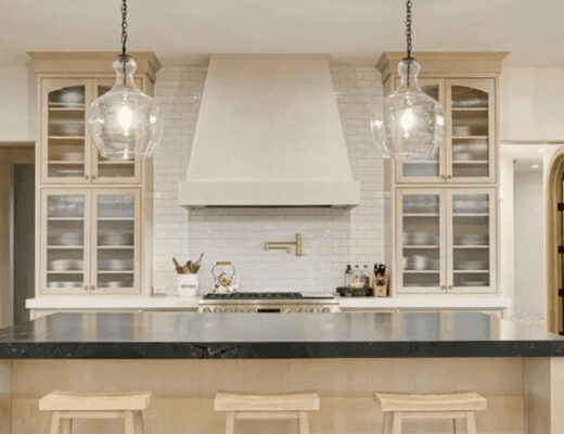
Many homeowners choose light counter finishes to create a timeless look that works with both modern and farmhouse kitchen styles.
Before you style anything, pull everything off the counter. All of it. This forces you to make deliberate decisions about what earns its place on the surface rather than just defaulting to whatever has always been there.
Once you are looking at a clean slate, ask three questions about each item you want to return. Does it get used at least once a week? Does it have a home somewhere else if it does not need to be out? And does it add something visually, whether through colour, texture, or form? If an item fails two of those three, it probably belongs in a drawer or cabinet.
This sounds ruthless, but it is the single most effective thing you can do before spending any money. A counter with five purposeful objects looks a thousand times better than one with fifteen things fighting for attention.
Group Items in Odd Numbers and Vary the Height
Interior designers use odd-number groupings because they create visual tension that feels dynamic rather than static. A pair of objects looks intentional but flat. Three objects, at different heights, create a natural focal point and draw the eye around the grouping rather than through it.
Height variation is the part most people skip. When everything sits at the same level, the counter looks cluttered even when it is not. Introducing a taller element, a cutting board propped on its edge, a small plant, or a pedestal piece, immediately adds dimension.
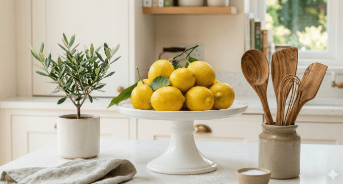
A white cake stand is one of the most versatile pieces you can use here. It raises smaller items like a fruit bowl, a candle, or a stack of napkins off the counter and creates the height contrast the grouping needs. The white finish reflects light rather than absorbing it, which keeps the space feeling open even when the counter is genuinely busy.
Use the Triangle Rule to Anchor Your Layout
The triangle rule is borrowed from floral arrangement and photography, but it translates perfectly to counter styling. Place your three anchor items so they form a loose triangle rather than a straight line. The tallest piece goes at the back or to one side, a medium-height piece sits opposite, and the smallest element fills the front.
This works whether you are styling a 24-inch stretch of counter or a full kitchen island. The principle scales because it is about spatial relationships, not absolute size. A tall olive oil bottle, a medium wooden salt cellar, and a small ramekin of fleur de sel follow the triangle rule. So does a propped cutting board, a cake stand holding a fruit arrangement, and a small herb pot placed in front.
Once you have the triangle locked in, filling the space around it becomes much easier. Secondary items slot into the negative space without needing their own visual logic because the triangle anchors the whole composition.
Bring in One Natural Element
Kitchens are full of hard, manufactured surfaces: stone, metal, glass, ceramic. Adding something organic breaks the monotony and makes the space feel lived in rather than staged. It does not take much.
Fresh fruit is the easiest option and it doubles as functional. A bowl of lemons or a cluster of figs on a cake stand works as decor until the moment you need it for cooking. Herbs in small pots add colour and scent, and they are genuinely useful. Even a single stem in a bud vase next to the coffee station adds enough warmth to shift the feeling of the space.
The key is treating the natural element as part of the composition rather than an afterthought. If you are using fruit, choose one variety or stick to a single colour family. A bowl mixing apples, bananas, and oranges reads as grocery stores overflow. A bowl of just green apples or mixed citrus reads as intentional.
Edit Seasonally, Not Constantly
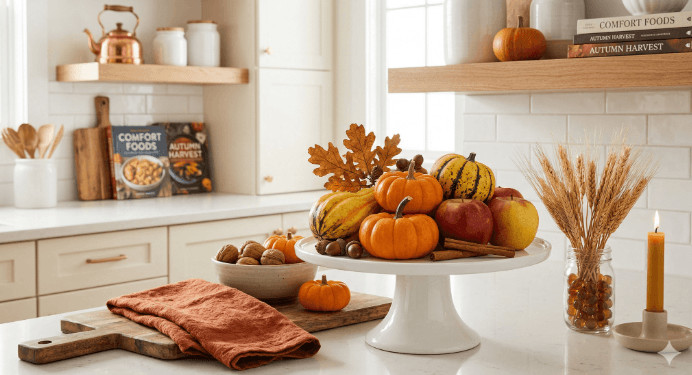
One of the easiest ways to keep a styled counter looking fresh is to treat it the way you would a seasonal wardrobe. You are not redesigning the space every week, but you are swapping a few key elements two or three times a year to keep it from going stale.
In spring and summer, lean into lighter colours, fresh greenery, and bright fruit. In autumn and winter, bring in warmer tones through a wooden board, seasonal produce, or a small candle grouping. The base layout, your triangle, your heights, your neutral anchor pieces, stays consistent. Only the accent elements shift.
A white cake stand is ideal for this kind of approach precisely because it is neutral. It does not fight with whatever you place on it or around it. Swap what sits on top of it and you have a completely different look with no additional investment in new pieces.
The One Rule That Ties Everything Together
Every well-styled counter has one thing in common: a clear surface below the arrangement. Not a spotless counter for miles in every direction, just a visible clean break between the styled grouping and the rest of the space. That negative space is what lets the eye read the arrangement as intentional rather than as clutter that happens to be organised.
If the items are good and the heights are varied and the natural element is in place but it still does not look right, it is almost always because there is no breathing room. Pull the grouping slightly tighter together and clear a few inches around it. The difference is immediate.
Counter styling is one of those areas where less effort and fewer objects produces better results. The goal is not a perfectly curated showroom. It is a kitchen that feels welcoming, functional, and genuinely yours every time you walk into it.
Ready to upgrade your kitchen space? Read more practical home and kitchen ideas at charlesandhudson.com/kitchen/.