There are places you walk into and forget within a week. The restaurant where the food was fine and the room was pleasant enough, the boutique that stocked things you recognized, the hotel bar with comfortable seating and nothing in particular to say. Then there are places that stay with you. You describe them to people. You remember specific details, the way the light hit the stone, the ceiling you didn’t expect, the feeling of the room contracting at the entrance and opening dramatically as you moved through it.
The difference between these two categories of commercial space isn’t always budget. It’s usually whether the designers committed to a clear idea and then built everything to serve it.
A Great Commercial Space Has a Point of View
Generic luxury is easy to produce and difficult to remember. Warm wood, ambient lighting, quality materials, neutral color palette, these things read as considered without communicating anything specific. The result is a space that feels pleasant in the moment and makes no lasting impression whatsoever.
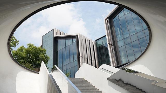
The commercial interiors that people return to and talk about almost always have a clearer position. F.O.G Architecture’s work in Shanghai commits to something, playful, specific, slightly unexpected in how it uses surface and scale. A restaurant that places its kitchen at the room’s visual center is making an argument about what the dining experience means. A boutique that treats its display system as a sculptural object rather than a functional necessity is telling you something about how the brand sees itself.
That clarity of point of view can express itself in very different directions. Calm and almost monastic. Theatrical and immersive. Raw and industrial, warm and tactile, compressed and dark, dramatically tall and light-flooded. What matters is that the space commits to something and then follows through with it consistently.
The Concept Has to Be Understood Before It’s Built
The challenge for any ambitious commercial interior is that the concept, however clear in the mind of its creators, needs to be understood by everyone who has to approve, finance, and build it. Owners, architects, brand teams, operators, and investors typically need to align around an intended atmosphere that doesn’t yet physically exist.
Before a hospitality or retail concept becomes a finished destination, design teams often need to align owners, architects, and brand stakeholders around the same visual direction. In that stage, mood boards, material studies, sketches, and commercial 3D rendering services can help clarify how the space is meant to feel before construction begins. The risk of starting without that alignment is that a concept gets diluted through successive compromises made by people who were never quite sure what the original idea was trying to achieve.
Restaurants Are Selling the Room Alongside the Menu
The destination restaurant is not a new idea, but what it demands from its interiors has intensified. In markets where strong cooking is increasingly assumed, the physical experience of dining carries more weight than it did a decade ago. The room has to do work.
The entry sequence matters. Whether a restaurant reveals itself immediately or unfolds gradually from a compressed arrival into a larger space, that decision shapes expectation and sets the emotional temperature of the meal before anyone has sat down. The bar or host area, wherever it sits in the room, gives the first impression of how the space treats its guests.
Seating density is a quiet determinant of the atmosphere. A room that’s too sparse reads as unsuccessful; one that’s too dense creates noise without energy. Good restaurant design finds the calibration between social charge and private enough that tables feel like their own territory.
Lighting does more emotional work than almost any other single element. Low, warm sources, candles, carefully positioned pendants, and subtle uplighting create the kind of intimacy that makes people lean in and stay longer. Harsh or high-positioned light does the opposite. The best restaurant lighting is usually barely noticed and completely felt.

Boutiques Turn Brand Identity Into Physical Space
Retail is undergoing a well-documented change, and the stores that are thriving in that change tend to be the ones that have genuinely rethought what a physical shop is for. When purchasing can happen anywhere and at any time, the boutique has to justify the visit on its own terms.
The ones that do this well treat the space as a brand argument made in three dimensions. The color choices, the material language, the shelving system, the fitting rooms, the floor, everything is working together to make a specific claim about what this brand is and who it’s for. A fashion boutique that uses raw concrete alongside polished display systems is saying something different from one that uses warm plaster and unlacquered brass, even if both are selling comparable garments at comparable prices.
The photograph-worthiness of such spaces is not incidental. A corner that creates a genuinely interesting visual moment serves both as a staging area for social media content and as a physical articulation of the brand’s aesthetic position. These things are not contradictory, the best boutique design works at the scale of the visitor’s body and at the scale of a phone screen simultaneously.
Hotels Live in Their Shared Spaces
Hotel rooms matter, but the shared spaces are often where a property’s character is most fully expressed. The lobby tells you what to expect from the stay within about thirty seconds of arrival. A lobby that’s confident about what it is, warm, eccentric, severe, maximalist, spare sets up the rest of the experience in a way that a neutral space simply cannot.
The best hotel lobbies are not waiting rooms. They are places people want to be. A hotel bar or lounge that attracts a mix of guests and non-guests, that becomes a destination within the neighborhood rather than an amenity within the building, tells you that the space is genuinely compelling rather than merely functional.
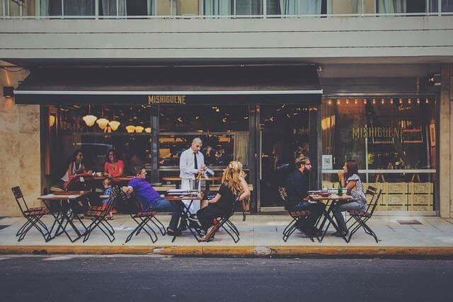
The materials and scale of shared hospitality spaces communicate positioning more directly than any marketing copy. Double-height volumes with carefully controlled daylight suggest a certain kind of ambition. Low, warm, close-furnished spaces suggest intimacy and privacy. Stone floors and tactile wall finishes say something about permanence and considered investment. A property that gets these signals right that has shared spaces whose atmosphere matches and reinforces its market positioning creates an experience that guests associate with the brand long after the checkout.
Lighting, Materials, and Scale Do the Emotional Work
Across restaurants, boutiques, and hotels, the same design instruments keep appearing as primary drivers of atmosphere.
Light, its temperature, direction, and intensity,shapes mood more efficiently than almost anything else. Warm sources at low heights create intimacy. Dramatic single sources create theatre. Even distribution creates neutrality. The choice is also a choice about what kind of experience the space is offering.
Material choices determine tactility and the subconscious sense of quality. Stone has a weight and permanence that composites can approximate but not replicate. Raw metal and reclaimed wood carry associations of craft and process. Polished surfaces reflect and multiply light; matte surfaces absorb and contain it. The material palette of a commercial space determines not only how it looks but how it sounds and how it feels to occupy.
Scale creates expectation and surprise. An entry that requires you to duck slightly and then opens into a double-height volume does something to the body that no wall finish can replicate. A room made deliberately small and close, where everything is within reach, creates an experience of enclosure and warmth that an open-plan equivalent simply cannot provide.
Designed, Not Just Decorated
The commercial spaces that stay with people are the ones that feel resolved, where the furniture, the lighting, the materials, the circulation, and the visual moments all read as part of the same intention. These spaces feel designed rather than assembled.
The distinction matters because assembling attractive elements produces something pleasant and forgettable. Designing a space from a strong central idea produces something that feels complete, that rewards being in it, that gives visitors the sense of having entered somewhere distinct.
That distinctiveness is what creates the most durable commercial advantage. It brings people back because the experience was specific to that place. It generates conversation because the place has something to say. It builds brand associations that advertising budgets can support but cannot substitute for.
The most memorable commercial spaces are not memorable because they are expensive. They are memorable because they committed to an idea and built a complete world around it.